Assignment 2 – Data Exploration through R

After assembling the data putting it into R I used ggplot2 to answer the following questions:

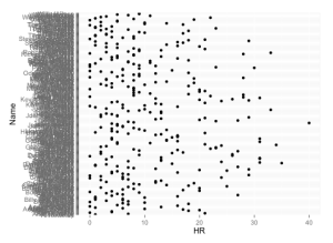
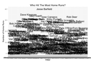
1.Who had the highest number of home runs (HR)? Jesse Barfield.

At first I got a scatter plot with the individual names on the y-axis which would ideally work if there were few enough names, but then I did an anesthetically pleasing way (shown second) with the name of the hitter placed instead of the point. Ideally I would love to add the label to the point on the graph to the left, but with my beginner skills I found using the two visualizations together works the best in this case (because there was a clear winner).

RplotHitterVhr2

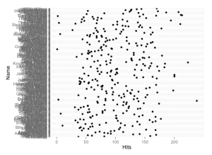
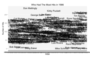
2. Who had the maximum number of hits in 1986? Don Mattingly.

I used the same (not ideal) technique that I used to answer the first questions. Again, I understand that I was only able to do this because there was a clear winner.

Rplot01HitterVhits1

3. Name the second most expensive team in the league?

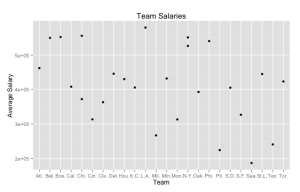
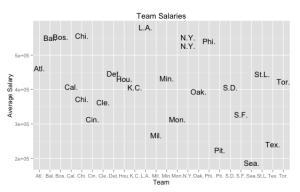
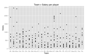
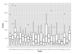
The best way to answer this question would be to sum all the salaries for each team, but I couldn’t find an effective way to do this with my skills. I used the team data to plot the average salaries for each team (shown in the first two visualizations). So then I used the hitter data to plot the salary verses the teams and got the third visualization. I then created a box and whisker plot per team. Though I can’t say definitively which team spends in total (on all the players) the second most. However, I can answer many other questions like: Chicago has the second highest average salary (shown by the team visualizations shown first). What was weird to me is that this did not coincide with the data from the individual box plot visualizations created with the hitter data. From this data I can conclude that Baltimore spends the most on an individual player and Boston the second; New York middle 50% (inner quartile range) extends the highest, but doesn’t start the highest; The average bar shows that Boston is the highest average salary, and Toronto the second. I attempted to get a stacked bar graph with the sums per team, but I feel like I would be more successful if I created that information with the data itself and then visualized it instead of the other way around.

TeamVsalaryTeamVSalaryTXT

teamVsalaryperplayer

Rplot03

Specific Goal: Are players paid according to their performance?

To answer this question I created many difference visualizations and will describe them one by one. I did manipulate the data by creating new variables that represent the percentage of hits, runs, home runs, etc. by using the number of hits and dividing it by the number of at bats. Another variable I created was the career percentage where I divided the number of hits, runs, etc. divided by their yearly average of hits, runs, etc. (their career hits, runs, etc. by the number of years they have played in the majors). This variable will be 1 if they are getting about the same amount as they have averaged in their career past, it will be >1 if they are doing much better in the current year and <1 if they are doing much worse in the current year.

Rplot1

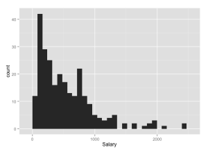
^ First of all I plotted a histogram of the salaries to see the distribution of the salaries, which is as expected with most of the salaries being on the smaller range.

Rplot2

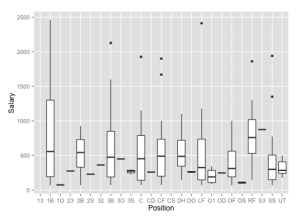
^ Plotted a box and whisker plot on salaries per position to see if there was any particular position that was clearly paid more than the others. However, it looks as though players of different positions are on average paid the same. (If I was continuing the research in this data I would investigate the positions of players only making over say 1,000 to see if there is a pattern within the players who make the most.)

Rplot3

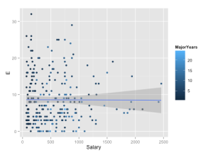
^Plotted salary against errors made using the number of years they’ve played in the majors for the color. The color shows that the those with higher salaries have played in the majors for a little while. The trend line added shows that errors didn’t seem to effect their salary.

Rplot4

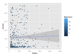
^ Plotting salary against the number of assists surprisingly shows that assists don’t seem to effect their salary either.

Rplot04

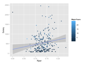
^ Plotting run percentage (runs/at bats) against salary. The trend line shows that as the runs percentage increases so does the salary. This would support the idea that players get paid according to their performance. Outlier on top all seem to be a darker blue and thus are newer players, so their pay makes sense. If they are lighter then they are either not paid according to their hitting/runs skills or they are paid disproportionately to to their skills.

Rplot

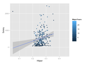
^ Plotting hits percentage (hits/at bats) against salary. The trend line also shows that the hits percentage increases so does the salary. This would support the idea that players get paid according to their performance. Outlier on top all seem to be a darker blue and thus are newer players, so their pay makes sense. If they are lighter then they are either not paid according to their hitting skills or they are paid disproportionately to to their skills.

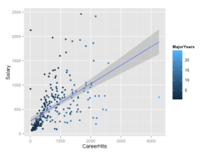
Rplot01

^ Plotting career hits against salary. The trend line shows that with an increase in career hits so does the salary. This would support the idea that players get paid according to their performance. Another thing seen from this visualization the players who’ve been playing longer with very small amount of career hits do not seem to get paid much, with some exceptions. Outlier is the point on the bottom right, with high number of career hits and a low salary, this player could have gotten most of those hits earlier in their career and is thus not playing as well now so they don’t get paid enough. Other outliers on the top left are players with high salaries and a low number of career hits, these players are probably not paid for their hitting (probably a pitcher) or its their first year so their career hits is their current number of hits (all darker blue) or they are not paid accordingly.

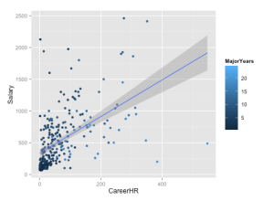
Rplot02

^Plotting career home runs against salary. The trend line shows an increase in salary as career home runs increase. This would support the idea that players get paid according to their performance. The players that have more career home runs that fall under the trend line are all players who haven’t played in the majors for very long, which makes sense that he new players that are hitting well in the first few seasons don’t have high salary contracts yet. This would support the idea that players get paid according to their performance, when you consider that they are getting paid based on past seasons performance. Outliers are the same as previous visualization but with home runs instead of hits.

Overall, the data still calls for more investigation; however at this point I will conclude that players get paid according to their performance. (Players that are shown to have higher performance but with lower salaries are assumed to not be of higher performance in a different category. Example: A newer player to the league with amazing unexpected stats then when they made the salary contract or a player that has great stats but just had an injury and was back from the DL. And players that are shown to have lower performance but with higher salaries are assumed to be of higher performance in a different category. Example: an amazing pitcher that makes a lot of money but is not the best hitter, therefore their hitting stats will be very low, but will be making a lot of money.
Chapter 9: Arrange Networks and Trees

This chapter in the book discusses design choices for arranging network data with node-link diagrams or matrices. Overall the text provided a solid summary report on the different techniques. I found the part about finding cliques and clusters in both matrix and node-link views very helpful. I thought the most interesting section of this reading was the costs and benefits section which compared the two previously described arrangement techniques very well. To summarize:

Connection Strength:

  • for small networks, they are intuitive for supporting many abstract tasks:
    • those that rely on topological structure
    • utilize general overview
    • finding similar substructures

Connection Weakness:

  • after a certain size and or link density reading becomes impossible (“hairball” effect)

Matrix Strength:

  • great for large and dense networks (with high info densities)
  • eliminates the occlusion of connection node-link views
  • predictable
    • screen space easily predicted (unlike link-node view)
  • stable
    • adding an item causes small visual change (unlike link-node view)
    • supports geometric or semantic zooming
  • easily reorderable
  • ability to quickly estimate the number of nodes in a graph

Matrix Weakness:

  • unfamiliarity (training needed to easily interpret, unlike node-link view)
  • lack of support for investigating topological structure

Visualization Viewpoints – User Studies: Why, How, and When?

Original Paper: http://www.csc.ncsu.edu/faculty/healey/download/cga.03.pdf

I read this article before creating my user evaluation over the summer and found it really useful in preparing for an effective user evaluation. Their inclusion on examples of studies and what they did is helpful. The “Basics of User Study Design” blurb inserted in the paper was a very clear background that I think was necessary for the reader to have. The most interesting part of this paper to me was about what to do when things “go wrong” or in other words you get data that fails to reject your null hypothesis and that just because null results aren’t necessarily publishable, they are super informative and can help you further your work so you can eventually get something worth publishing. Overall, it is clear that good user studies can enhance the quality of your research.

The Challenge of Information Visualization Evaluation

Original Paper: http://hcil2.cs.umd.edu/trs/2004-19/2004-19.pdf

Overall, I felt like this paper, especially compared to the other two user evaluation papers we are reading this week, is pretty disorganized and not as carefully laid out. This paper did emphasize the fact that usability testing and controlled experiments are the basis of evaluation. I thought the part about taking into consideration the training of the users was interesting because when I was working on my user evaluation this idea definitely came up and it is pretty important whether you want to train the user and if so how much. I thought the section on learning from the examples of technology transfer was the most interesting.

Empirical Studies in Information Visualization: Seven Scenarios

Original Paper: http://enrico.bertini.me/material/tvcg2011-seven-scenarios.pdf

The biggest thing to notice about this paper is its thoroughness and the extensive amount of background work that went into it, which is clearly shown with table 1. They do a good job of presenting a “descriptive rather than prescriptive approach,” which they mentioned as a goal early on in the paper. However, because of this, the paper is kind of a boring read, even though it doe a good job at presenting a bunch of potentially helpful information. A bulk of the paper is describing the goals/outputs, example evaluation questions, and methods and examples of each of their seven evaluation scenarios. These scenarios are: Understanding Environments and Work Practices (UWP), Evaluating Visual Data Analysis and Reasoning (VDAR), Evaluating Communication Through Visualization (CTV), Evaluating Collaborative Data Analysis (CDA), Evaluating User Performance (UP), Evaluating User Experience (UE), Evaluating Visualization Algorithms (VA). I think the paper does a good job at explaining visualization evaluations and are encouraging to get people to reflect on their goals before choosing methods.

Try R

Screen Shot 2014-09-28 at 6.36.30 PM

Today I tried R and completed Code School’s 7 chapters of exercises. Here’s some screenshots of the chapters below!

Screen Shot 2014-09-28 at 6.36.43 PMScreen Shot 2014-09-28 at 6.36.54 PMScreen Shot 2014-09-28 at 6.37.04 PMScreen Shot 2014-09-28 at 6.37.16 PMScreen Shot 2014-09-28 at 6.37.25 PMScreen Shot 2014-09-28 at 6.37.34 PMScreen Shot 2014-09-28 at 6.37.42 PM

Spatial Text Visualization Using Automatic Typographic Maps

While reading this paper I could not stop thinking about the San Francisco art styled typographic maps of the districts (which to be honest I kind of like). However, this paper was showing how there is a much more efficient way of producing a typographic map with a computer. Typographic maps merge text and spatial data and can be used for traffic density, crime rate, demographic data and more. Mostly became popular because of their high visual aesthetics. A particular visualization mentioned that became really popular was the common text visualization (a word cloud), but this paper listed a couple problems with such visualizations. I think the most memorable figure in the paper was the side by side comparison, which I thought was very effective. Yes, you could see some obvious differences, but not super ridiculous ones, so when the time it took gets taken into consideration the 2 weeks to 2-3 seconds is remarkable. Also I thought the scenario of a cop looking at a map with the highlighted specific area of interest in typographic style was interesting.

Geovisualization for Knowledge Construction and Decision – support

This paper stemmed from the idea that there is a lot of visual digital data being collected from geospatial referencing from vehicles, PDAs, cell phones, etc, that should be utilized in a visualization, a geovisualization to be exact. They describe geovisualization as the process for leveraging data resources to meet needs and with GIS it is also a field of research and practice that develops visual methods and tools for lots of applications. As one would assume geovisualization draws from both cartography and geography. They present four functions, which are: explore, analyze, synthesize, and present. There are three main applications for geovisualization: public health, environmental science, and crisis management. (The environmental science part interests me the most, because it seems like a field I could utilize my math major, and my minors in computer science and environmental science!) One really cool thing is that this paper referred to a paper written by a woman (the Viewpoints paper) and I think that’s a first from the papers we’ve read!

Colorbrewer.org: An Online Tool for Selecting Colour Schemes for Maps

This paper explains how to select color schemes by: number of data classes, the nature of their data, and the end-use environment (something I didn’t necessarily think of previously). Other things I learned from this paper include the idea that diverging schemes are always multi-hue sequences. We all know that nominal data has no order, but now I also know that it doesn’t make sense to pair it with light to dark color scheme for that exact reason. When working with the data class number there is a fine line between generalization and too many colors to differentiate. The more complex the spatial patterns, the harder it is to distinguish slightly different colors. I found it interesting that illustrator and photoshop use different color conversion algorithms. Something I learned was the difference between design and display mediums and how much paying attention to these are. After checking out http://colorbrewer2.org I found it very clear and useful. It will definitely be a resource of mine in the future!